

Here's something lots of well-meaning compliance people say that can cause a lot of unintentional chaos:
"We need some [pictures, video, animations] because they're engaging."
NO. NO NO NO.
This is coming from a good place: wanting to reach your employees. But it actually makes it harder for them—and especially for global employees.
Here's why.
Why it's harder for your employees.
Every visual you add to a document increases the amount of stuff your reader has to pay attention to. And when you pile on more stuff to pay attention to, you can make it harder for people to learn.
This is the concept of cognitive load.
This is a pretty basic concept in instructional design, and here's a very simplified way to state it: don't distract people from the important stuff with a bunch of silly stuff.
Unfortunately, adding pictures or video for the sake of "engagement" is often exactly that: silly stuff that doesn't actually help people process the concepts you want them to learn. Because when you pile on a bunch of silly, flashy stuff to get engagement, you can get exactly that—engagement, but with the silly stuff that doesn't matter.
Why it's even worse for your global employees.
This problem is even more serious for your global employees.
Because if your translations go wonky—or if you're not translating in the first place—they're going to need to rely on the pictures for help interpreting what you meant. And that means your pictures need to actually mean something, not just be random things added to boost engagement.
To get what I mean, imagine that you get rerouted on an international flight and have to land in a country that uses a totally different alphabet.
You can't read that alphabet, none of the airport signs are in English, and instead of the familiar icons you're used to seeing for "bathroom" or "passport control," they've decided to use random stock photos of businesspeople shaking hands.
How would you find the bathroom? Or passport control?
That's the position your international employees can find themselves in if your translation gets jacked up and your pictures are just there for decoration.
You can't just add stuff for engagement. It has to mean something.
Meaning is hard—but do it anyway.
I want to be fair: using visuals with defined meaning is hard. Creating our standardized icon set took a long time, and it didn't get written up in Compliance Week because they thought what we did was easy. We made a visual language, and that's hard.
And on the other hand, it's really easy to view visuals as an unqualified "engagement" booster that can be added on to anything.
But you know that's ridiculous, right?
I mean, think about the most common variant of that quote I started with, which is "we need some training videos because videos are engaging."
You know that's not true. Because if it was, you wouldn't have 500 channels on TV and still think there's nothing on. Most video is terrible, and terrible doesn't get the job done—this isn't the late 19th century where people are mesmerized by video just because it's a moving picture.
So you know that you can't just slap stuff on for engagement; in reality, you've likely always known that.
What you need to embrace is that although using visuals with meaning is hard, it's worth it—because the alternative is doing something that might actually hurt more than it helps.

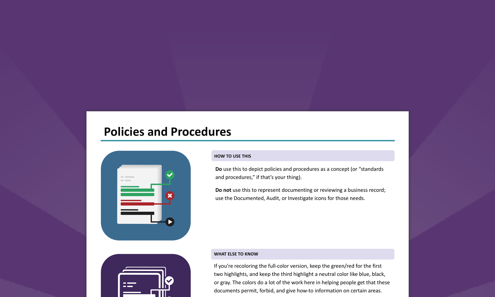
Want to make this easier? We've already done the work: our icon set comes with standard definitions and instructions on when to—and when not to—use each one!