
![[Blog header] How to choose the right infographic layout for your compliance content.](https://www.thebroadcat.com/hubfs/How-to-choose-the-right-infographic-for-your-compliance-con.png)

Flowcharts. Checklists. Uber-graphic one-pagers. Each are super powerful tools that can make a significant impact in your compliance program. But how do you decide which is the best tool for the task?
"It's just pictures—it's super simple!" you say. "Download some clipart and you're good to go!"
Well, there's more than just putting a bunch of pictures (or numbers) next to words. Just like how there are an insane variety of charts to visualize quantitative data (we see you, suggested charts in Excel), there are TONS of qualitative infographics. Each serve their own purpose depending on the message you want to convey and action you want to encourage.
So how do you choose???? And what kinds of guidelines exist for each of them?
That's why we have this post! We wanted to give you a little insight into the secret Broadcat design sauce that goes into our awesome job aids. Settle in for some guidelines, examples, and tips for successful compliance tools.
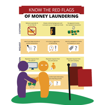
Basic infographics (minus the numbers)
Use this if you’re introducing a high-level summary of a new concept or process.
You might see them in a textbook, in an email, or posted on a wall or piece of equipment. This purest form of a qualitative infographic is the most adaptable to work with—it's basically any combination of graphics, illustrations, and words.
The imagery can attract attention in urgent or changing environments, or it can help trigger the memory of a reader who’s just learned something new. That's because our brains respond so well to pictures.
Rules to follow when designing infographics:
Headings are crucial: choose something that tells the reader why this infographic matters and when they should use it.
Keep it simple: divide the content into no more than 3-4 categories.
Keep it brief: keep sentences or phrases short (30-40 characters).
Be smart with your graphics: pair phrases or headings with images that closely represent that piece of information—the images are functional, not decoration, and should be used consistently in all your tools and messaging.
Arrows are your friends: if you’re illustrating a process, use numbers or arrows to help guide the flow of reading down the page.
Don't get stuck on the format: if the content starts to become more granular, it's worth considering other formats that may be more appropriate for your message. Let's break that down...
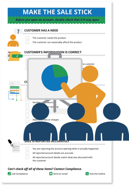
Checklists
Use this if you want to improve a high-stakes process.
Once you start making checklists, it’s tempting to make one for EVERY SINGLE PROCESS. I’m guilty of this—it feels so rewarding to check items off! But if they’re not used strategically, they can potentially overshadow the task at hand.
Checklists are best for routine processes that have a lot of room for mistakes (you know, like most processes involved at the workplace). A lot of experts (like surgeons and pilots) work these into their risky processes as sort of an extension of their memory so they can focus on the full picture without having to remember every small, but potentially life-saving, step. And the content doesn't need to be complicated: bulleted lists can often be transformed to a checklist, making your message way more practical and useful.
As for design, checklists often don't include a lot of images—they can be distracting if not used well—but you can incorporate them subtly to support visual flow and readability.
And don't underestimate the value of the checkboxes themselves! These bad boys signal to your reader how they should interact with the information you're presenting them.
Rules to follow when designing checklists:
Establish patterns to guide your reader:
Use icons along with headings to make it easy to scan.
Follow a consistent sentence structure.
Make list items similar in length.
Include a similar number of list items in each section.
Confirm the list items in each section:
Are framed similarly (e.g., either positively or negatively).
Can be completed within a reasonable window of time (no super-massive "steps" that take six months).
Provide enough context to understand when they’re complete.
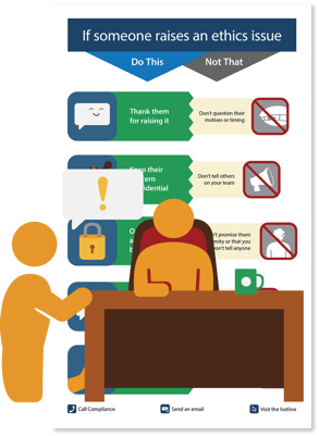
Contrasting examples (or, "do this" / "not that")
Use this if you want to improve a process that’s not intuitive.
Everyone from machinists to kindergarteners can benefit from this powerful format: you might see these detailing operating instructions on machines or on the walls of kindergarten classrooms teaching kids about behavior.
Why so magical? Because they do a lot of invisible work. If executed well, they can provide context to an ambiguous decision without the reader even realizing what's happening.
How? Well, showing opposite ends of the spectrum for each step of a technical process where a person’s judgment is exercised can help clear up any confusion that might disrupt that process. And, when using contrasting examples for behavioral decisions, you can bring to light unconscious biases that may keep the reader from seeing the alternative impact of their actions. See? Magic! 💫
Rules to follow when designing contrasting examples:
Your contrasting pairs should be pairs: make sure one half of the pair isn’t more obvious or specific than the other.
Don't overuse pics: use spot illustrations only if they accurately represent the content (again: function, not decoration).
Keep it even: keep line items similar in length. Otherwise, you risk your pairs looking unbalanced—and therefore distracting.
Color means something: use color to support your tone (e.g., green as positive, red as negative).
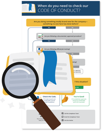
Decision trees
Use this if you’re guiding people through decision-making.
These are the hardest (and my favorite!) to design. They're often misused—I mean, we’ve all seen the convoluted decision trees that you have to read at least 10 times just to get to the first conclusion—but unless they're for entertainment (I watched over 5 hours to see the different paths!) or to illustrate a point, complexity is NOT compliance's friend.
So let's talk about how you can use a decision tree to improve a workflow. Approach it as an exercise in user-experience design and put yourself in the shoes of the audience: consider what they know, what their goal is, and how that will affect the way they interact with the information presented.
If not everyone in your audience needs to see the full process, consider breaking the information down for one audience—the more specific you get, the simpler you can be. If your audience needs to stop reading the decision tree just to answer any of the questions in it, take a step back: there’s probably a better format for your infographic.
Rules to follow when designing decision trees:
First, know when NOT to make a decision tree:
If you have multiple audiences with different roles, divide your content into an infographic for each role (they might even be two different formats!).
If the audience can’t answer the questions with a clear "yes" or no," try contrasting examples instead, and you can specify the "yes" and "no" for them.
If each question leads to a nuanced outcome, create a table chart instead, with all the possible outcomes along one axis.
If a decision tree IS the right format for your content:
Go with the flow: group questions that lead to similar outcomes for an easier flow.
Get outta there fast: order things by leading with questions that get you out of the tree quickest—if an answer takes you out of the decision tree, that should be one of the first questions.
Be positive: frame questions positively where possible (and definitely avoid double-negatives).
Don't switch it up: follow a consistent sentence structure in all your questions to make it easier to scan.
Don't switch sides: place all the “yes” answers on the same side instead of switching back and forth.
Simplicity is your friend: find the simplest path for your last arrow, and frame the other arrows around it. It may be harder for you to do, but your readers will sincerely appreciate the simplicity.
Go the same way: try to keep all the arrows flowing in the same or similar direction.
It's the destination, not the journey: make your conclusions (the ends of your different arrows) easily identifiable by styling and placing them similarly.
Remember the original goal.
It’s easy to get lost in the layout forest and forget the goal of your original message, so remember to zoom out and reference your purpose when designing. It’s also OK to break your own rules if they start to work against your goal!
There's no cookie-cutter way to design anything. All of these formats are going to require or allow for different rules, depending on your message. I’ve slowly gathered these are practices while working on our team of talented designers, but I'm sure you and your team have your own style and go-to practices that work best for you! Just remember: keep your reader in mind, and use the right tool for your goal. 🛠️