
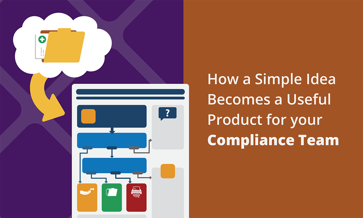

Here at Broadcat, designing compliance training materials that are useful and functional for our audience is something that we are passionate about. We want to make sure our training resonates with our audience, is presented in a clear format, avoids distractions, and centers around what people actually do. In order to meet these criteria, we rely on design as a tool, because by applying design principles correctly in the training we create, we accomplish our goal of helping people do the right thing. 😇
But before any training product is available in Compliance Design Club, we must go through our design process, which can be rigorous and complex, yet guarantees that each job aid, checklist, decision tree, infographic, module, or any other training material we create meets its goal.
Let the fun begin!
Before the design team kicks off production, one of our wonderful Subject Matter Experts (SMEs) does extensive research to write the content to be included in the training. 🤓 Once the content has been written, the designer must review it and familiarize themselves with the topic(s) to create something that our audience will be able to digest and understand. Then, the SME and designer collaborate on a format that will engage our audience. Here is where we, the design team, ask all the important questions so we can then proceed to the next step.
Design Production
During the sketching process, we must consider how to lay out the information, whether we have the necessary white space to be able to read each section or what visual aids we can include to support the message. Often, this is also the stage of the process where we reconsider the format that we are using, i.e., should we make it a checklist or should it be a decision tree? Would the employees receive the training digitally or physically? 🤔
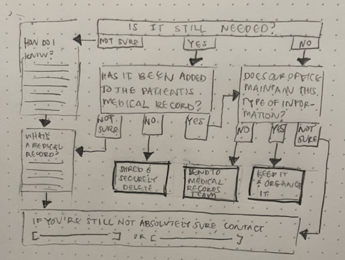
Here’s an example of what sketching a decision tree can look like. ⬆️ This is for our “Can you throw it away?” piece. (Available here, but don’t look just yet! It’ll spoil the ending.)
This sketch is pretty complex because decision trees tend to be more nuanced. We had to consider the placement of each question box, the route each arrow will take, and finally ask ourselves: “Would the person using this be able to follow it step-by-step and know exactly what they need to do with the information they have?” After we’ve landed on a workable sketch, we digitize it and start adjusting the structure as needed.
In the case of our decision tree, the first version looked like this:
Your eyes don't need to be adjusted, the words are blurry on purpose!
Want to get full access to Compliance Design Club? Send an email to us!
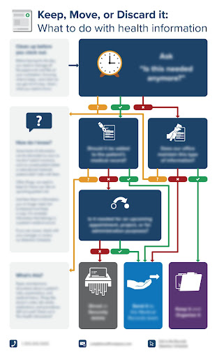
At this point, colors were introduced, illustrations were added, and content was edited. During the process of coming up with the first version, we noticed that the directional arrows started to get too confusing and overwhelming, making the piece feel crowded and hard to follow.
We went back to the drawing board, and decided to reconsider how we were using the white space, which led us to a horizontal, rather than vertical, orientation. The SME also edited the job aid so we could use the space as efficiently as we could without sacrificing any important steps.
Here’s what this translated to:
Let us know if you want a demo of Compliance Design Club!
The dark navy and tangle of bright arrows on the previous draft made the piece too hard to follow—your eyes don’t know where to look, which is a BIG problem in a flowchart! 👀. To fix it, we adjusted the colors to introduce more grays, making each question more neutral and easy to read, and removed a few illustrations to help the audience focus on the questions. Adjusting the layout to a landscape orientation made the directional arrows more clear. And after we implemented these changes, we came up with a new version of the job aid to send to be proofed.
Edit and Review
Our proofing process is the step we spend the most time on because this is where we refine the job aid as much as possible so that we can deliver a perfect product to our customers. It is crucial that we consider all the details, from illustrations to typography to colors, and the way we’ve applied our design principles.
Another part of the process—and my personal favorite—is showing the revised version to someone else on the team who hasn’t been a part of the project. This is the perfect opportunity to test the training we’ve created and to hear honest feedback that allows us to know what’s working well and what isn’t working how it should.
Finally, we implement all our feedback and do one final review to ensure all the edits have been made and it’s ready to be sent out to our customers.
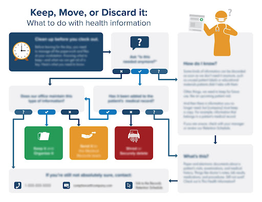
And that’s how we got to the final version:
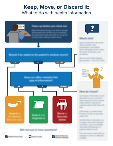
Ta-da! 🥳
Thought this was an easy, straightforward process, huh? As you can see, it’s actually one that takes lots of rigorous work and several revisions. That is why design plays such a big role when it comes to creating functional and useful compliance training: In the end, we want to keep it simple so that our customers—and their employees—know exactly what to do.
---
To learn more about Compliance Design Club, schedule your free consult!